Ste. Michelle Wine Estates
Borne of Fire Wine Brand & Label Design
The Challenge
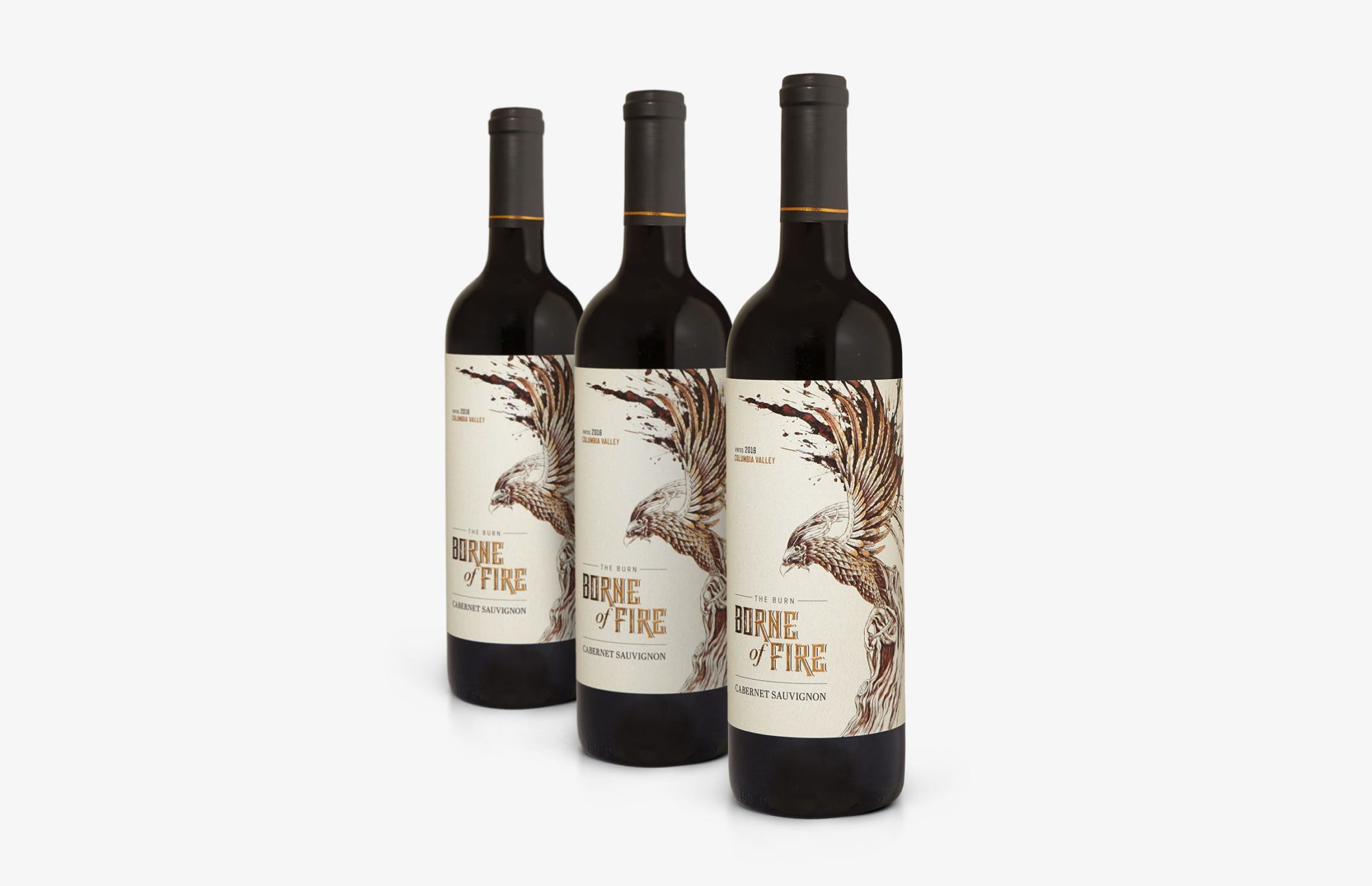
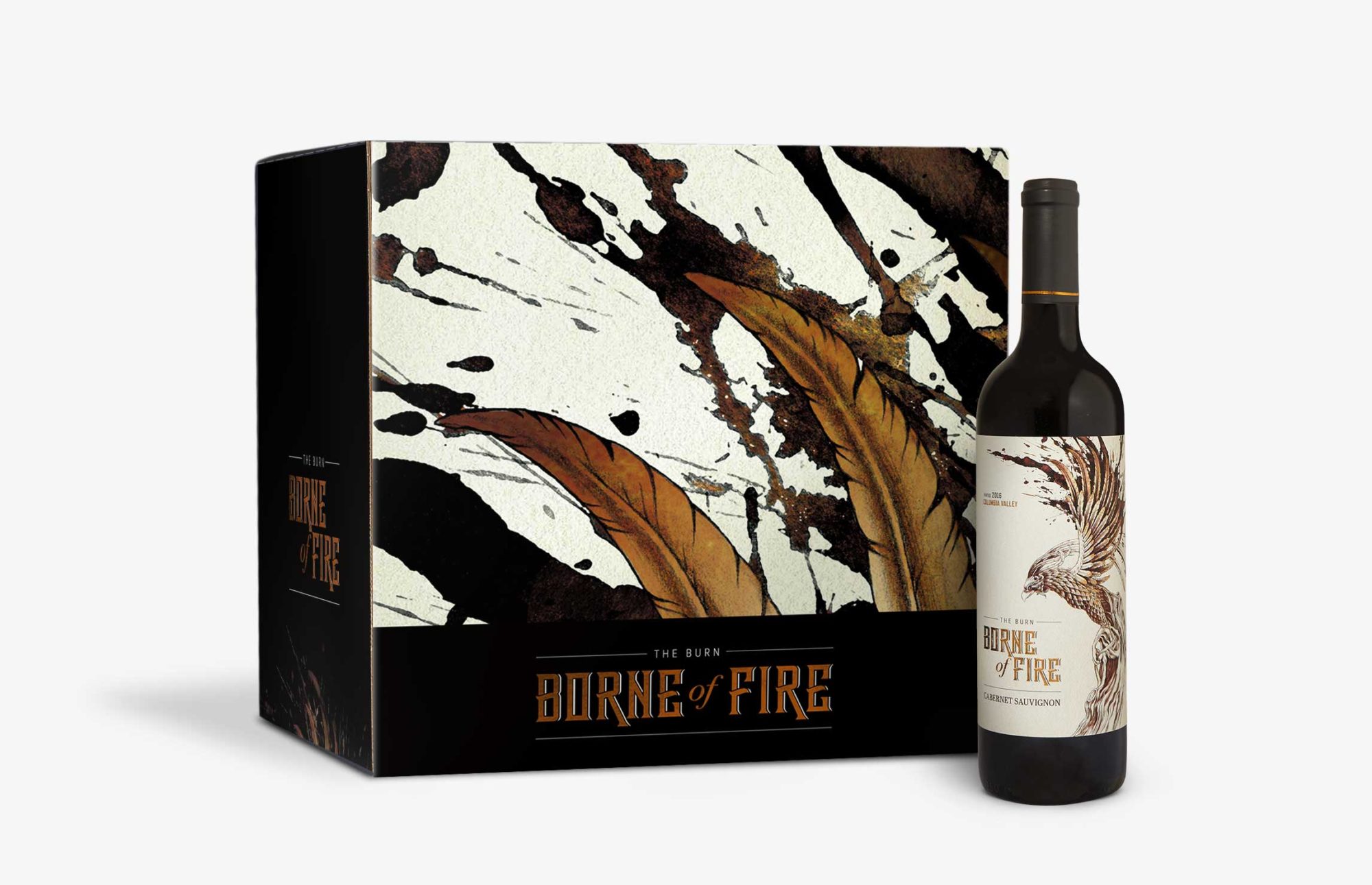
There is an area in eastern Washington known as The Burn, so named for the ancient tradition of burning crops to enrich the soil there for future growth. Borne of Fire represents the fruits of that foresight. We were tasked to create a brand that would make a bold statement about the connection between wine and the places it’s made.
The Outcome
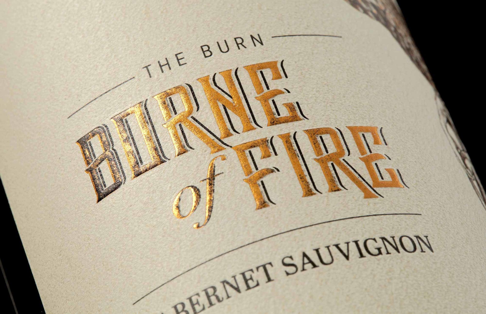
We immediately gravitated toward the idea of fire as a cleansing force and an agent of rebirth. The phoenix-like creature that leaps off the label is a piece of custom art, and the earthy colors and flecks of foil capture the intensity of fire and the incredible power of nature to reinvent itself. This cab is the epitome of terroir—reflecting the rugged yet elegant landscape that produced it.
a