Canon 13 Wines
Wine Label Design
The Challenge
Canon 13 is a pair of on-premise wines from the Santa Lucia Highlands in California’s Central Coast. Stretching from roughly Santa Cruz to Santa Barbara, it’s a region that’s very much caught between the materialistic trappings of LA to the south, and the more traditional and reserved personality of Napa and Sonoma to the north. Ste. Michelle Wine Estates asked us to create a wine label design that would capture that elusive and unpretentious Central Coast vibe.
The Outcome
Our discovery process drew us towards the region’s history. The name Canon 13 was derived from the vineyard’s proximity to Nuestra Senora de la Soledad, the 13th mission on California’s famous Mission Trail. The Franciscan monks that settled in the area during the 18th century planted the first vineyards, and so we set out to create a label that would pay homage to their humble, genuine, hand-crafted sensibilities.
a

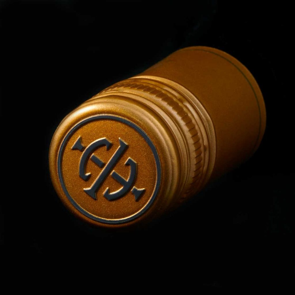
Foils take on the look of hammered copper, and the icons, representing the natural, religious and historical aspects of the region, form a playful pattern inviting the consumer in for a second level of viewing and discovery.
From the unique die cut shape to the deep earthy tones the overall aesthetic of this label is simple yet sophisticated.
