Ste. Michelle Wine Estates
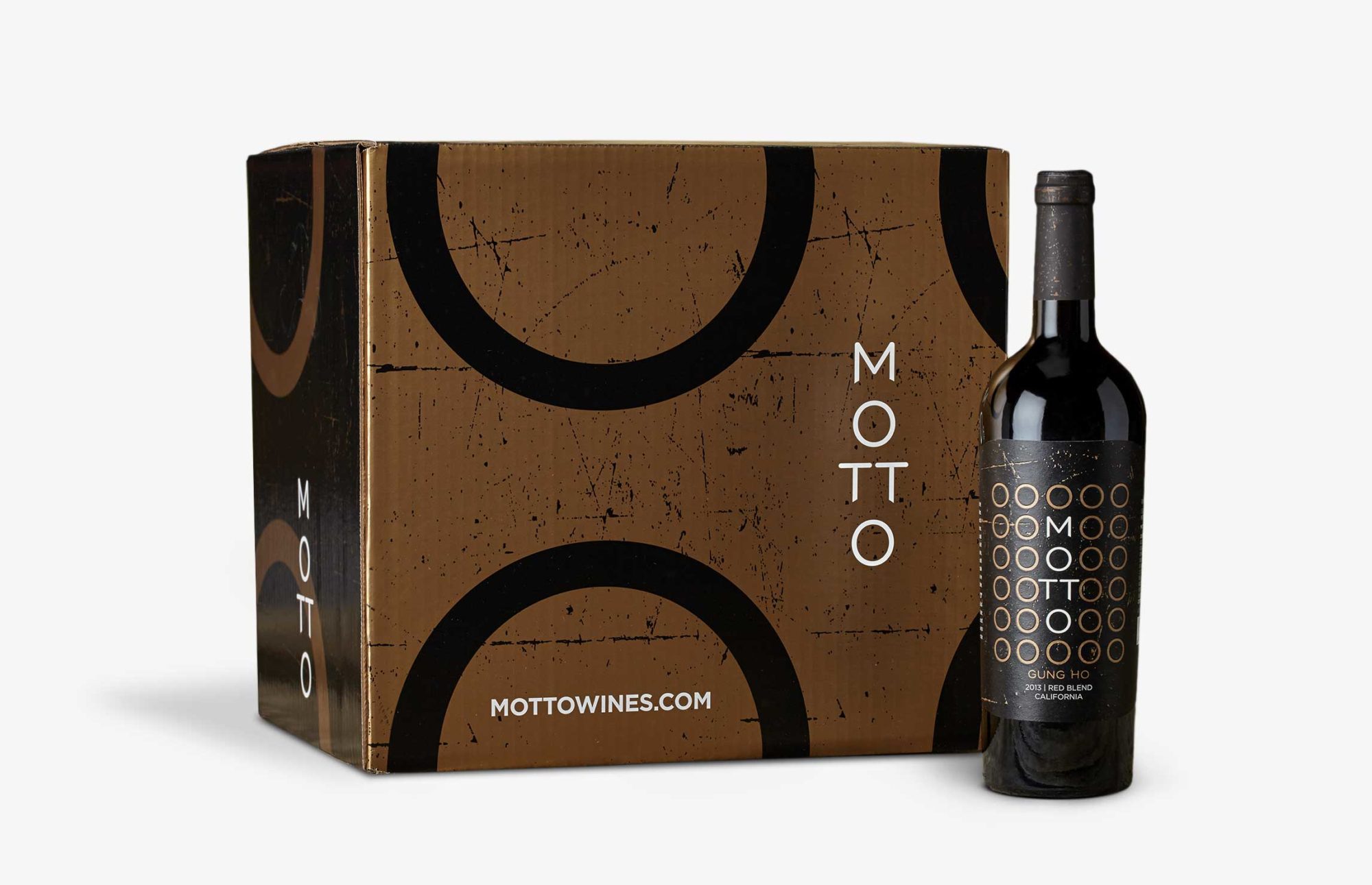
Motto Wine Label Design & Packaging
The Challenge
“Dark” wines represent an emerging yet lucrative category targeting young, affluent, urban males—aka “beverage geeks.” These guys are attracted to edgy brands. They want to be the first to try new things and to tell you all about them. Ste. Michelle Wine Estates asked us to craft a brand story and wine label design that would help them ride this trend and plant a firm stake this competitive category, instead, we gave them what would be next.
The Outcome
When we looked at the category, it was surprisingly gimmicky and homogenous, with everyone leaning on dark colors and aggressive type. Rather than just follow-the-leader, we looked for ways to fit into an established category, but redefine it at the same time. Through contrasting light and dark tones, our suite of label designs leverages geometric letterforms to create a monogram-like treatment—distinct, personal, with equal measures of sophistication and personality.
a
The brand story took the form of a slightly edgy, if not rebellious, manifesto that was used to inform label, website, and collateral copy.
Well this is something new. Looks like somebody’s been pushing the boundaries a bit. But isn’t that the way the best things always happen? Tipping over a few sacred cows, not taking the conventional wisdom at face value, learning the rules so you can break them with style? At least that’s our Motto. A wine with backbone behind its elegance—a complex companion that manages to stay in balance while it keeps everyone else on their toes. Sure, we may ruffle a few feathers along the way, but to tell you the truth, they weren’t the flock we were planning to uncork this with anyway. After all, the path separating genius and insanity is a narrow one. Who’s up for a good stroll?
“Doubleknot has been an excellent creative partner who has worked with us collaboratively in conceptualizing and designing innovative new branding for Ste. Michelle Wine Estates. They understand the process, work to gain a clear understanding of our project needs, and have helped us to find new ways in keeping a fresh edge with our efforts. Great service and solid results.”
Brett Scallan
Vice President of Marketing, Ste. Michelle Wine Estates


