Foley Family Wines
El Pino Club Wine Brand & Label Design
The Challenge
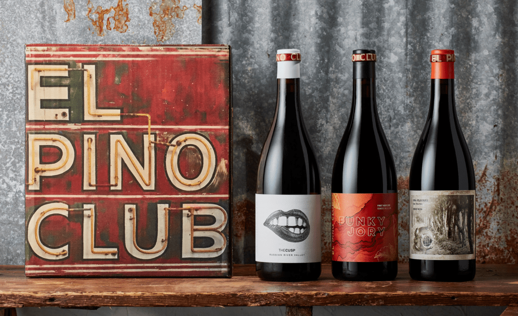
Now this was a fun one. El Pino Club isn’t so much a wine brand as it is a fan club for Pinot afficionados. It’s a curated collection of Pinot Noir from different producers and different regions. This is a full-throated celebration of this varietal in all its forms and with all its glorious quirks. The challenge was to create a shapeshifter wine brand and label design that could morph to reflect the unique wines in the portfolio and elevate the different flavors and regions. Our client was clear from the beginning that the only thing we absolutely could not do was be conservative.
The Outcome
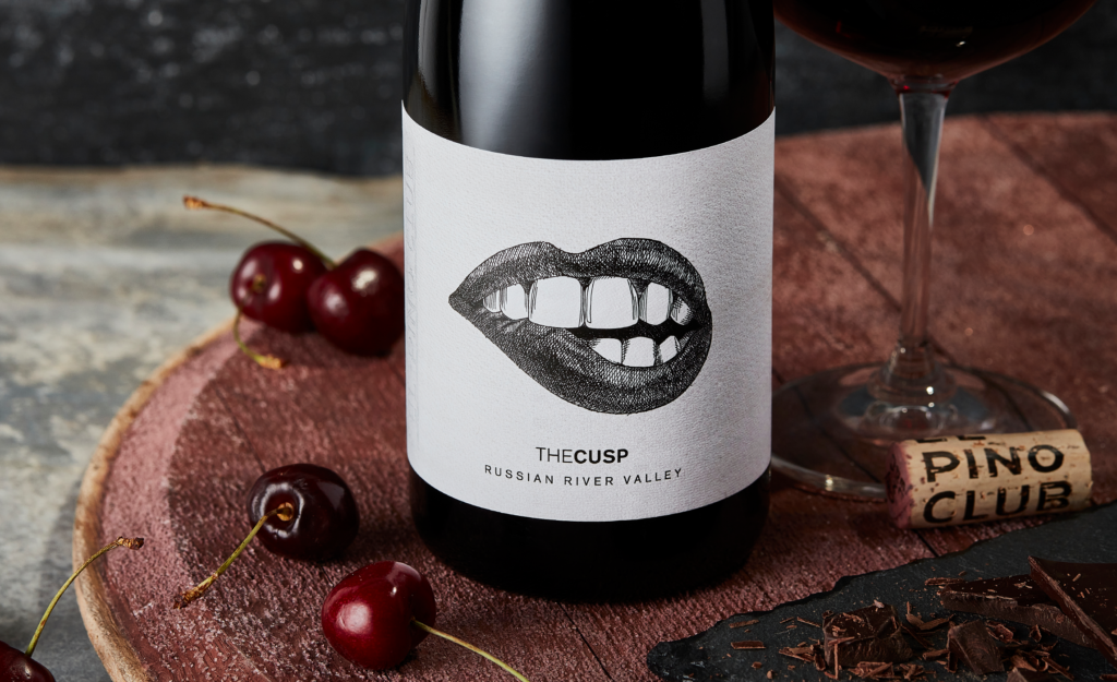
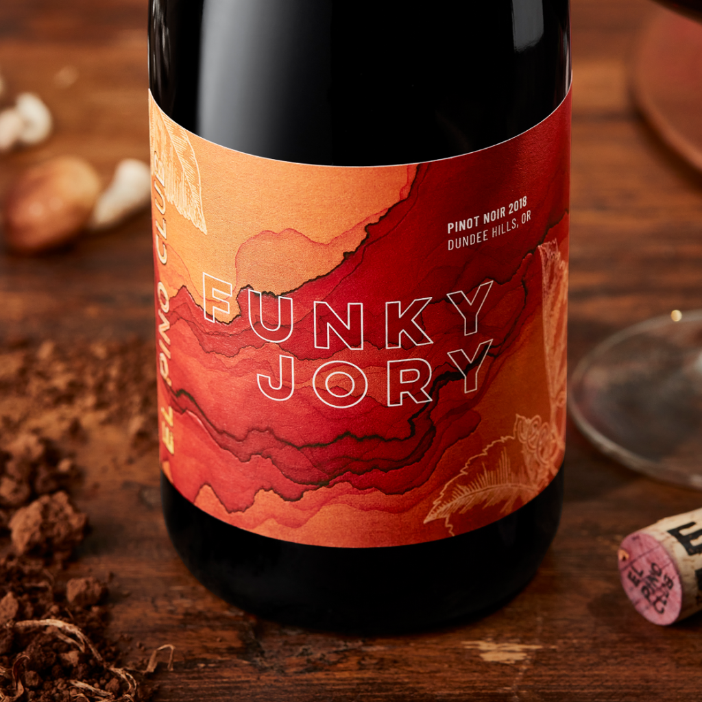
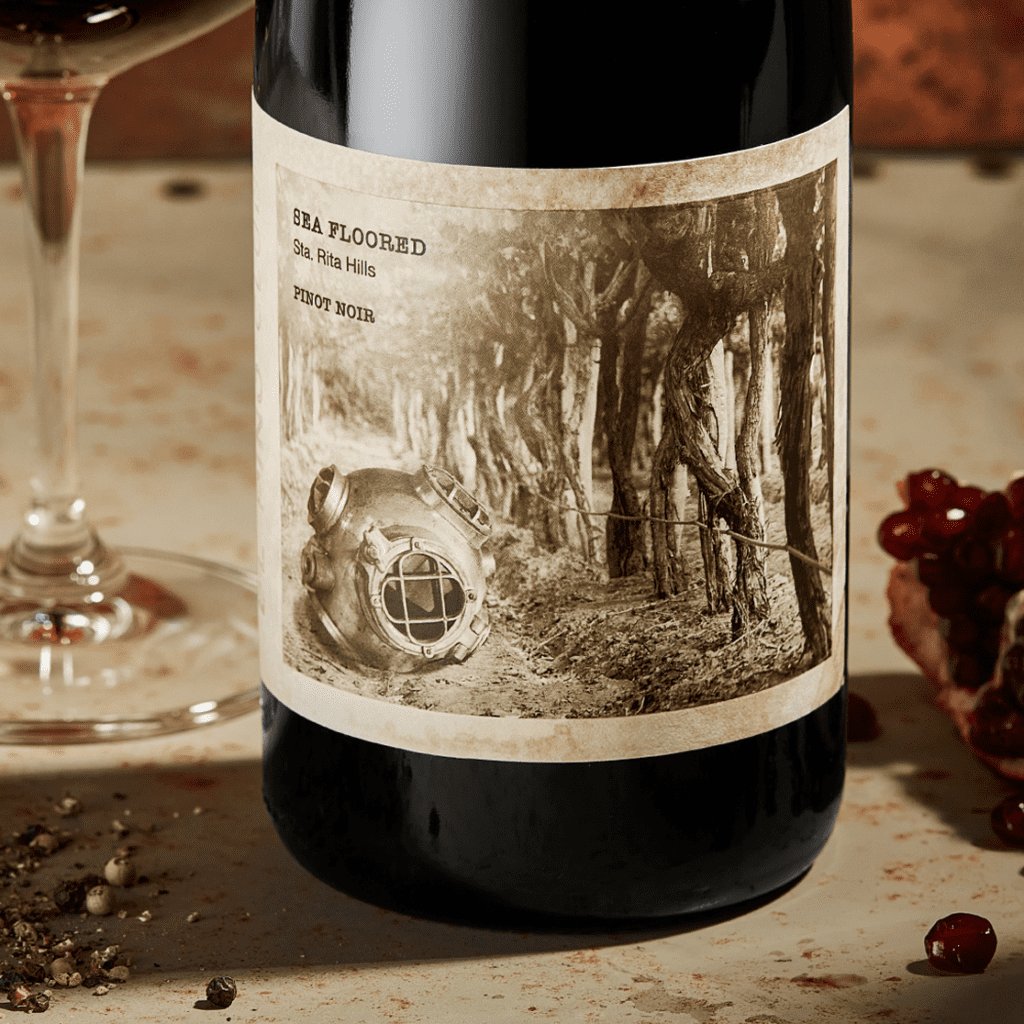
Step one was naming. We dug deep into the stories and terroir of the initial SKUs to find names that were bold and unexpected while telling a unique story about the growing region or flavor profile. We then dove into label design, exploring wildly different looks anchored by the core logo element that is inspired by a rad vintage neon sign hanging in their tasting room. Every facet of the brand is oozing with personality, just like the grapes they represent. It’s an invitation to Pinot lovers and the Pinot-curious to discover the multifaceted personality of this quirky grape.
The names—Funky Jory, Sea Floored, The Cusp—and label designs hint at facets of each wine’s origin. From the rust-red Jory soils of Oregon’s Willamette Valley, to the ancient marine sediments that enrich the vineyards of the Sta. Rita Hills, to the ever-shifting fog that creeps through the Russian River Valley and cools the fickle fruit.
Brand Story
FOR THE LOVE OF PINOT
We created El Pino Club because we freaking love Pinot. It’s fickle, it’s funky, it defies expectations, and we wouldn’t have it any other way. We curate exceptional Pinot Noir from around the globe, so that you can see the world through the eyes of this wonderful little grape.
Every member of El Pino Club is a unique and lovably-quirky character, bursting with personality, and undeniably true to itself. As individual cast members, they are an ode to the lands and the hands that produce them, and as an ensemble, they celebrate the full range and charm of this legendary varietal.


