Ste. Michelle Wine Estates
Tenet Wines Label Design
The Challenge
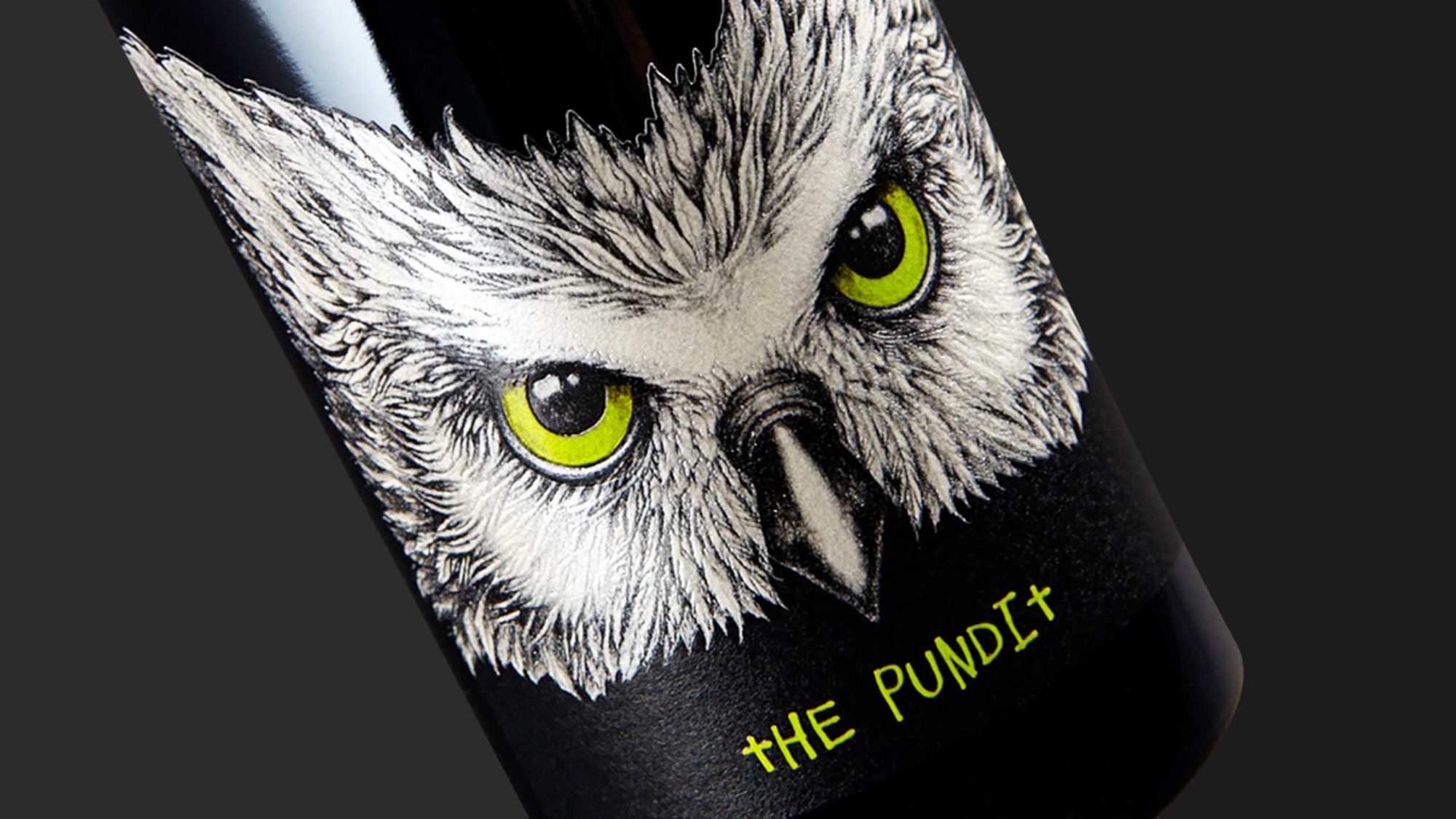
Due to the huge influx of inexpensive, fruit-forward Shiraz from Australia, Syrah has become a misunderstood varietal and an over-saturated category. That’s a travesty, because some of the best Rhone-style reds in the country come from Washington-grown Syrah. With the release of this new series of wines—Tenet, The Pundit and Le Fervent—Ste. Michelle Wine Estates wanted to put Washington Syrahs back on the top shelf.
The Outcome
The eponymous Tenet label features an austere yet visually compelling ambigram—a mark which retains its’ meaning regardless of the orientation. Ambigrams have a long history as symbols of deeper meanings and hidden truths. In this case the “truth” revealed is the true nature of the Syrah varietal. The classical blackletter script, roguish angle, diecut label and short capsule all combine to create a dynamic, engaging presence on the shelf.
a
Tenet Wines represents an international collaboration between Ste. Michelle Wine Estates and two of France’s preeminent winemakers from the Rhone Valley—Michel Gassier and Philippe Cambie.
As unique as this project is, they asked for branding that would also stand out within their existing portfolio.
In addition to label design, our work included a positioning statement, if not a proclamation, that unabashedly embodies the spirit of this wine:
This is our conviction—that in the right hands, these vines can grow into a revolution, putting an elegant stake in fertile ground and turning the Syrah world upside down, bottle by bottle. This is a chance to break free of hidebound expectations, reveal truths long hidden, and change minds about what’s possible. This is our manifesto, expressed in the language of Rhone’s ancient hills and inscribed root-deep in the extraordinary soil of the Columbia Valley. This is wine worth believing in. This is Tenet.


